Yesterday, at around 10pm PT, Google officially announced it is launching Google TV. Google TV has a fully functioning browser that you use from your television in your living room or bedroom. So now, not only will you be able to roam most streets of this planet with Internet access from your mobile device, you get to surf the Web from the comfort of your couch or your horizontal office when you’re just too tired to make it out of bed.
This is a great advancement for technology, connectivity, and laziness, but for those of us who create and market websites, this adds a totally new variable we must consider when creating and marketing those websites.
There will now be a “10 foot UI” (UI=User Interface) which means that viewers will be about 10 feet away, or sofa-to-TV distance, and the images will need to be optimized for this new medium. Some of what “Optimized for TV” means:
- Text will need to be large enough for “10 foot UI”
- Site navigation can be performed through button arrows on the remote, more like tabbing on your laptop computer, rather than by using a mouse pointer
- Selectable elements need to provide a visual queue when selected
There are MANY new recommendations and requirements Google is outlining for websites to be more user friendly on Google TV. As for now, I’ll be awaiting my test version of Google TV to give you a full review.
Predictions
I’m predicting Google TV to take a while to catch on if it does. If you have an extremely aggressive Internet marketing campaign, and already have a dedicated mobile site created for users of mobile smart devices, then I would recommend you jump now to create another Google TV version of your website to accommodate new Google TV users. For those of you without the time, budget, or desire at this point to make custom changes, I wouldn’t worry about it until you start seeing laptop sales drop and Google TV devices flying off the shelves at your local electronics store.
For your next updates on your website, I would recommend making sure you have CSS navigation with a link hover state added if you do not already have this. If you are an existing client of Webtyde’s, you would already have been urged to have CSS navigation installed. The CSS navigation will enable Google TV users to navigate your website.
Here is the official Google Webmaster Central Blog entry:
Optimizing sites for Google TV
Just as mobile phones make your site accessible to people on the go, Google TV makes your site easily viewable to people lounging on their couch. Google TV is a platform that combines your current TV programming with the web and, before long, more apps. It’s the web you love, with the TV you love, all available on the sofa made for you. Woohoo!
Because Google TV has a fully functioning web browser built in, users can easily visit your site from their TV. Current sites should already work, but you may want to provide your users with an enhanced TV experience — what’s called the “10-foot UI” (user interface). They’ll be several feet away from the screen, not several inches away, and rather than a mouse on their desktop, they’ll have a remote with a keyboard and a pointing device.
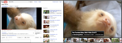
For example, here’s YouTube for desktop users versus what we’re calling “YouTube Leanback” — our site optimized for large screens:
See our Spotlight Gallery for more examples of TV-optimized sites.
What does “optimized for TV” mean?
It means that, for the user sitting on their couch, your site on their TV is an even more enjoyable experience:
- Text is large enough to be viewable from the sofa-to-TV distance.
- Site navigation can be performed through button arrows on the remote (a D-pad), rather than mouse/touchpad usage
- Selectable elements provide a visual queue when selected (when you’re 10 feet away, it needs to be really, really obvious what selections are highlighted)
- and more…
How can webmasters gain a general idea of their site’s appearance on Google TV?
First, remember that appearance alone doesn’t incorporate whether your site can be easily navigated by TV users (i.e. users with a remote rather than a mouse). With that said, here’s a quick workaround to give you a ballpark idea of how your site looks on TV. (For more in-depth info, please see the “Design considerations” in our optimization guide.)
- On a large monitor, make your window size 1920 x 1080.
- In a browser, visit your site at full screen.
- Zoom the browser to 1.5x the normal size. This is performed in different ways with different keyboards. For example, in Chrome if you press ctrl+ (press ctrl and + at the same time) twice, that’ll zoom the browser to nearly 1.5x the initial size.
- Move back 3 x (the distance between you and the monitor).
- Check out your site!
And don’t forget, if you want to see your site with the real thing, Google TV enabled devices are now available in stores.
How can you learn more?
Our team just published a developer site, with TV optimization techniques, at code.google.com/tv/web/.
Written by Maile Ohye, Developer Programs Tech Lead


Recent Comments